Office Interior Visualization for Modern Workspaces: What Makes a Render Feel Premium?
Learn what makes office interior visualization feel premium, from glazing and lighting to layout clarity, brand atmosphere, and commercial presentation value.
By Bevel GraphicsPublished
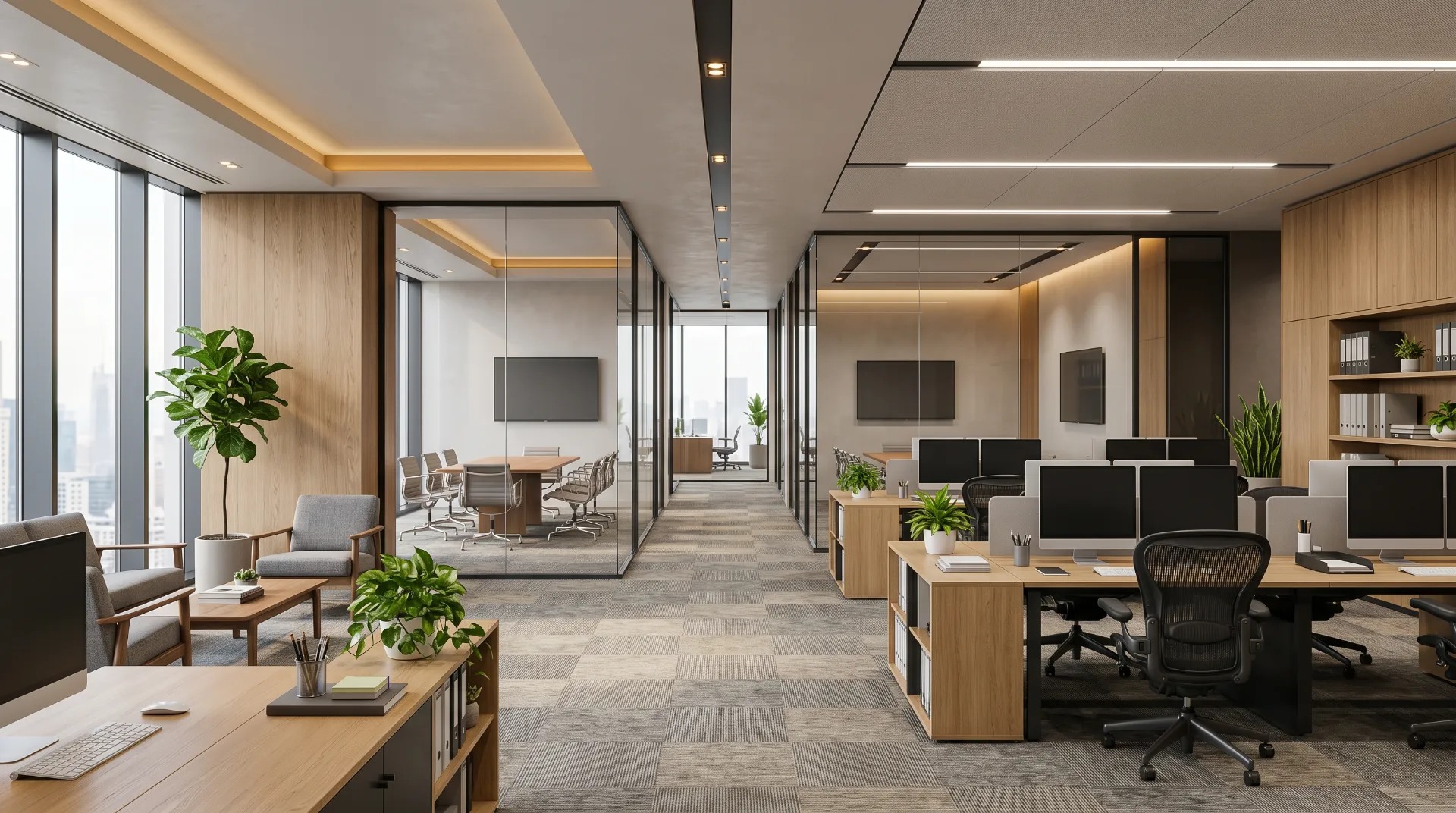
Premium office interior visualization is not only about making a workspace look clean and modern. A strong office render has to communicate how the space functions, how daylight moves through it, how meeting areas relate to open desks, and how the overall atmosphere supports the brand or business using the space.
What Clients Usually Need From an Office Render
- A clear view of the overall workspace layout
- Visual proof that the office feels functional and professional
- A presentation image for leasing, marketing, or investor review
- A way to test atmosphere, finishes, and furniture direction before execution
- A realistic preview that helps internal teams make decisions faster
What Makes the Image Feel Premium
The strongest office visualizations usually combine several things well: clean proportions, believable desk spacing, balanced glazing, realistic material contrast, controlled lighting, and camera angles that show both openness and hierarchy. Premium does not only mean expensive finishes. It means the image feels resolved, usable, and credible as a professional workplace.
Important Visual Elements in Office Presentation
- How open-plan desks relate to private rooms and meeting zones
- Daylight quality from perimeter glazing
- Warm and neutral material balance
- Ceiling lighting that supports the architecture
- Storage, circulation, and furniture spacing that feel realistic
Why This Helps Before Build-Out
Office interior visualization helps teams align early. It can support design review, help explain a workplace concept to decision-makers, and create stronger presentation images for commercial leasing or brand rollout. A polished render reduces uncertainty and gives the project a clearer visual direction before implementation starts.
Frequently Asked Questions
Can office renders help with leasing or marketing?
Yes. Well-made office renders are often used in leasing presentations, pitch decks, brochures, and commercial marketing to show the intended quality and atmosphere of the workspace.
Do I need a full interior design package first?
Not always. A floor plan, measurements, and a clear style direction are often enough to begin the visualization process and define the workspace atmosphere.
What matters most in an office visualization?
The most important elements are believable scale, layout clarity, lighting quality, and a material direction that matches the kind of workplace being presented.